Building a university brand around pathways, progress and transformation.
ALTU was a speculative identity project developed around the proposed merger of Athlone Institute of Technology and Limerick Institute of Technology into a new Technological University.
From the outset, I wanted the brand to feel different from more traditional university identities. The positioning was based on ALTU as a challenger brand — modern, progressive, and inclusive — with a belief that university-level education should be accessible to anyone through different pathways and access routes.
That idea of pathways became the foundation of the identity.
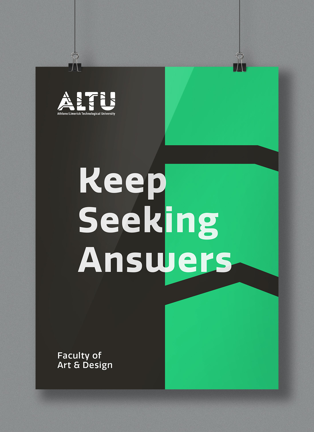
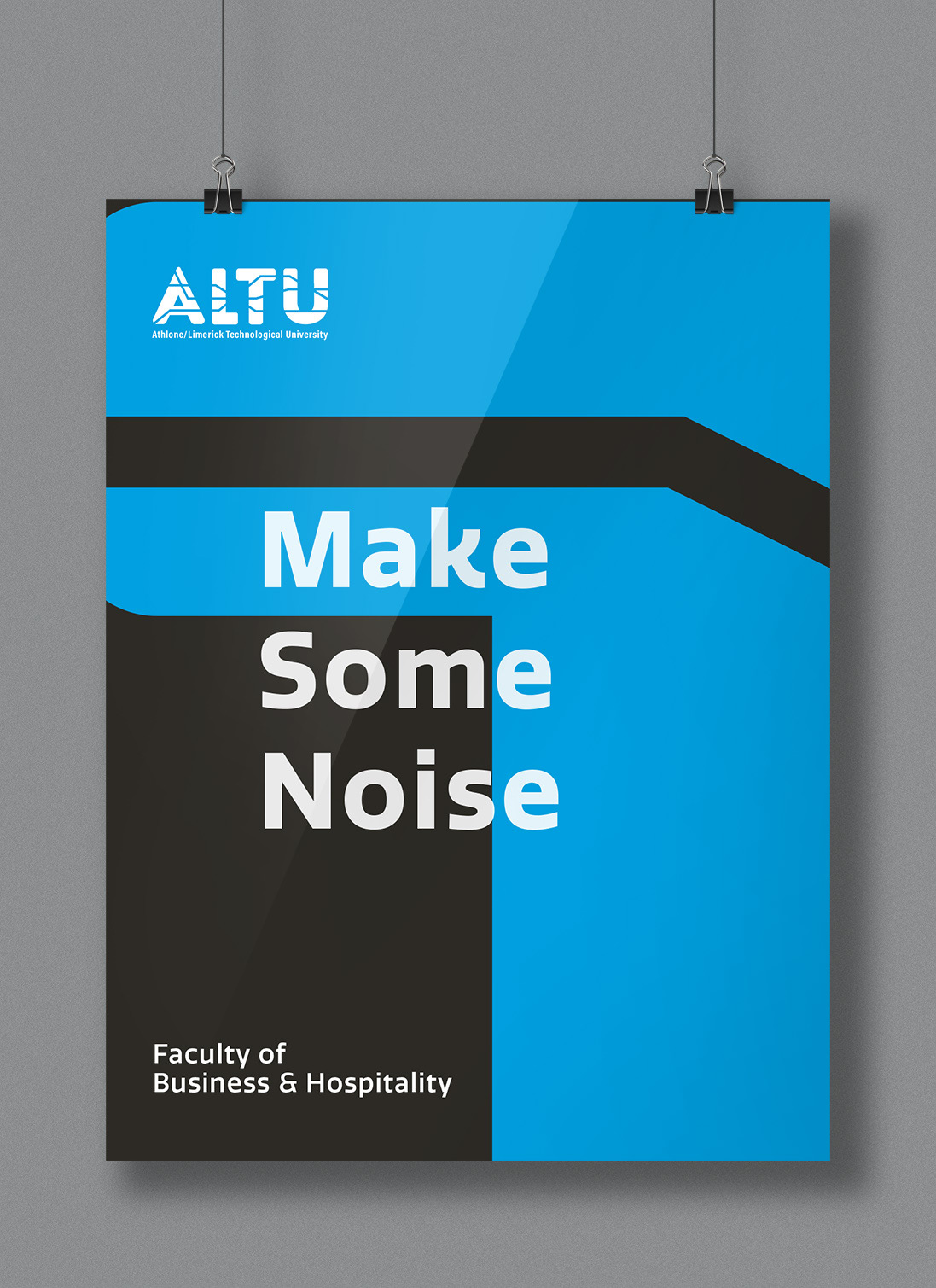
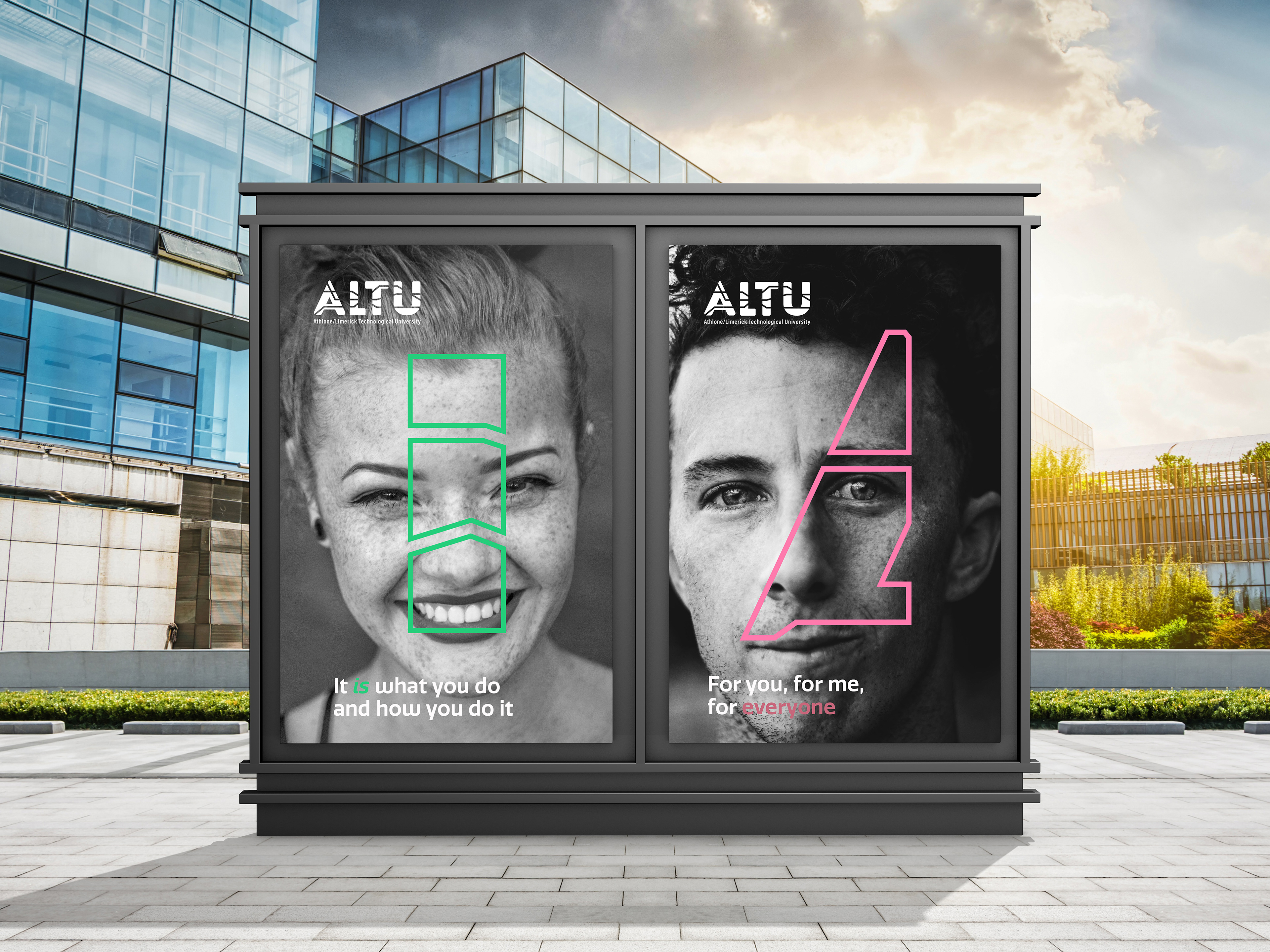
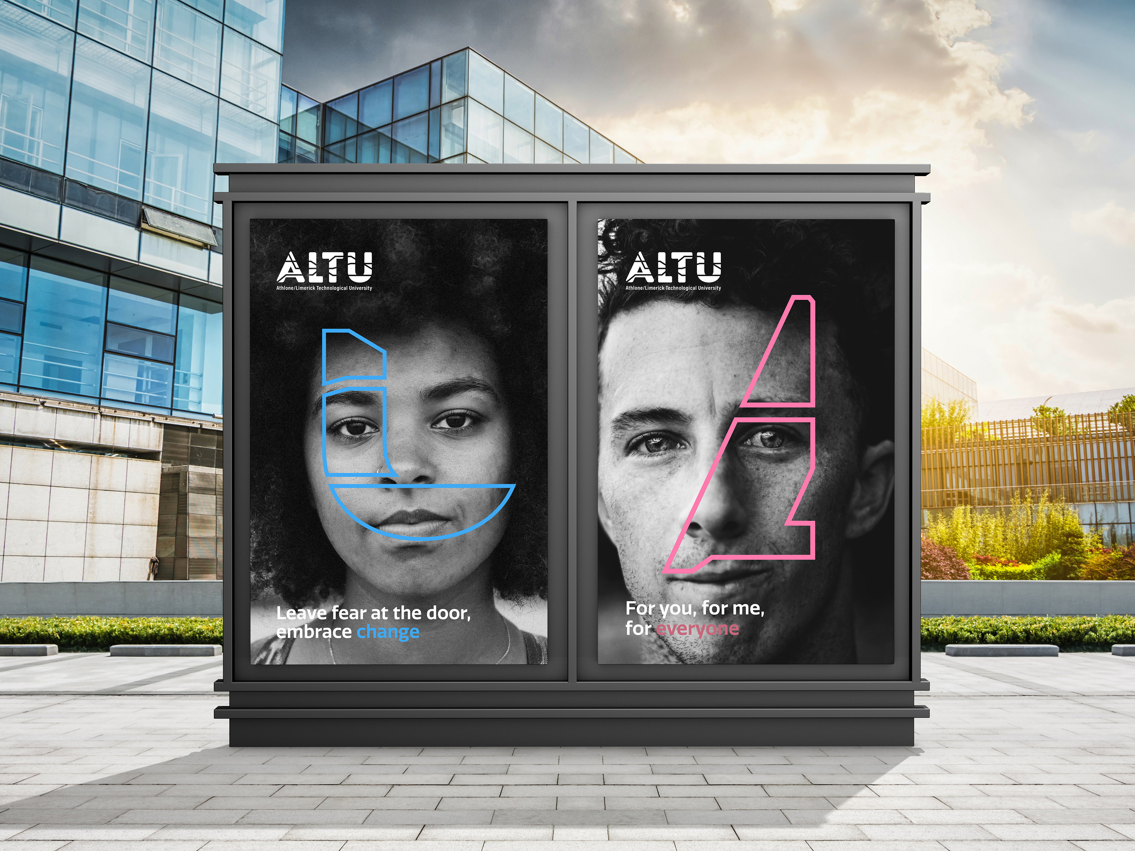
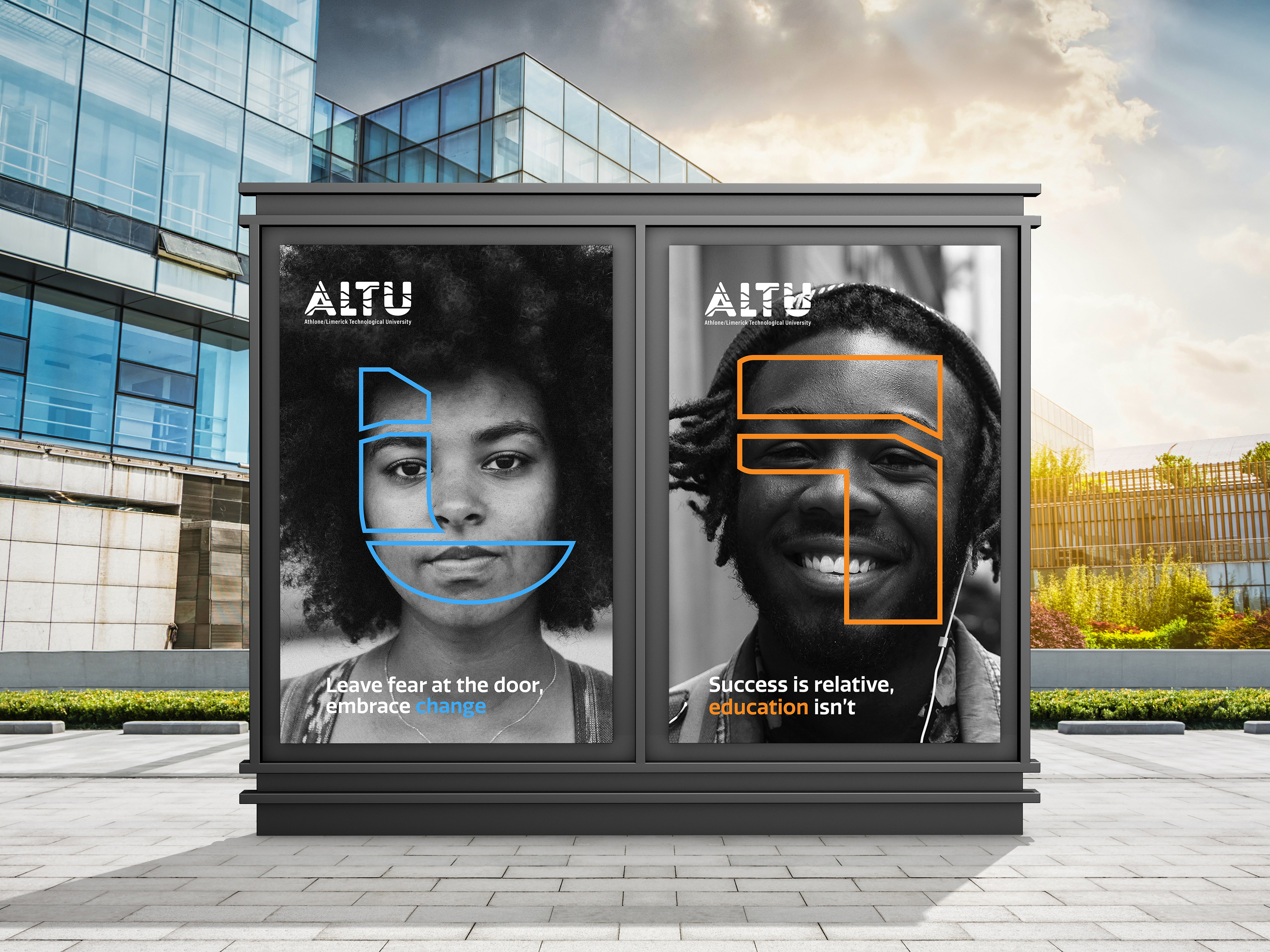
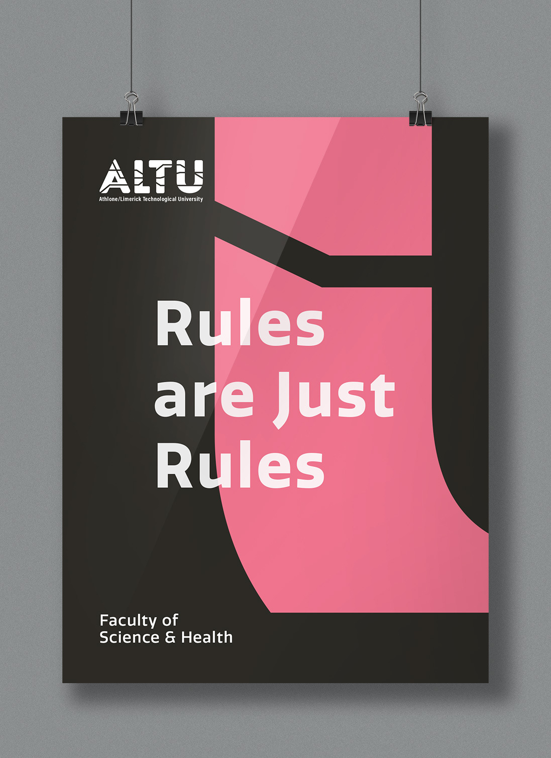
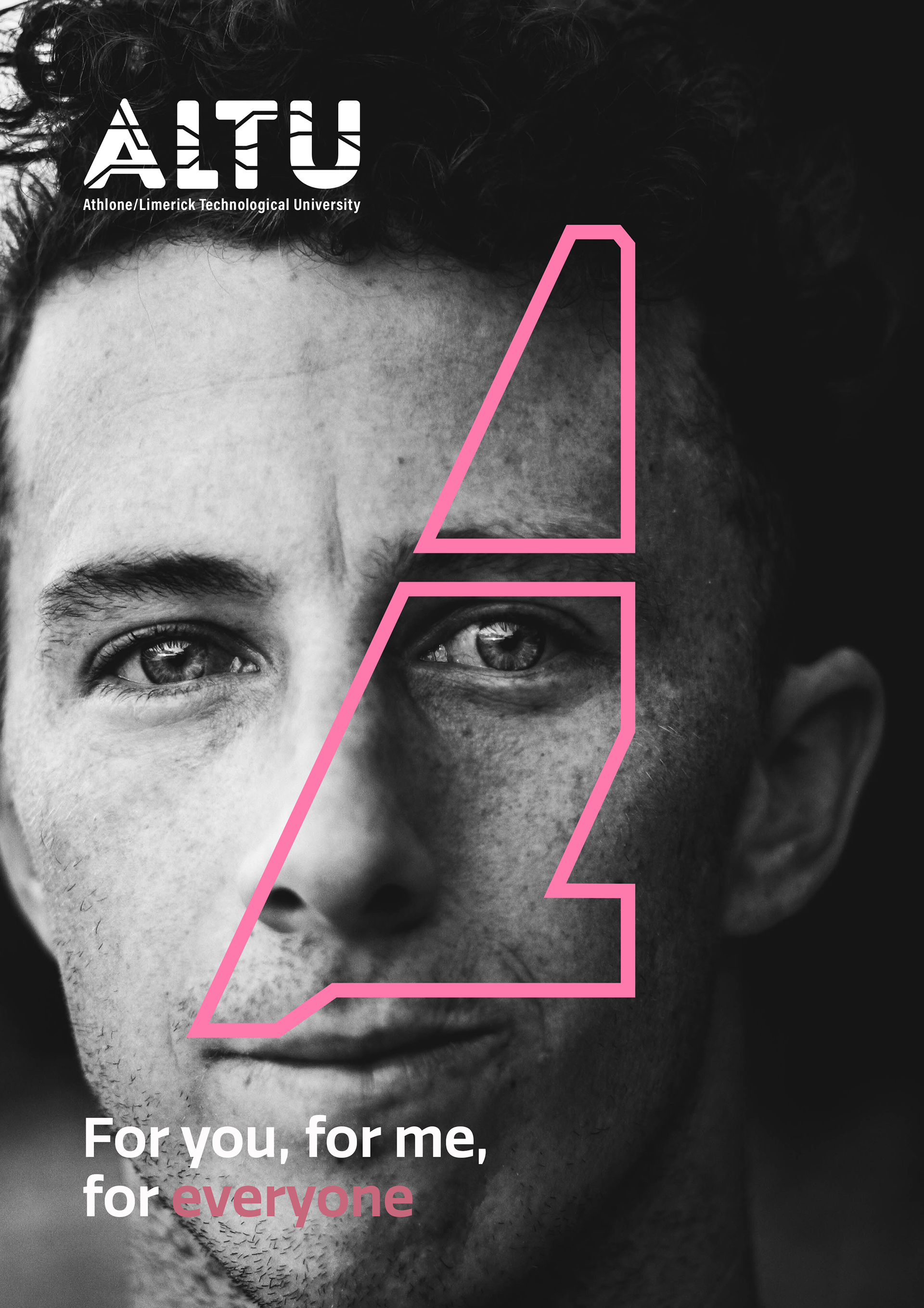
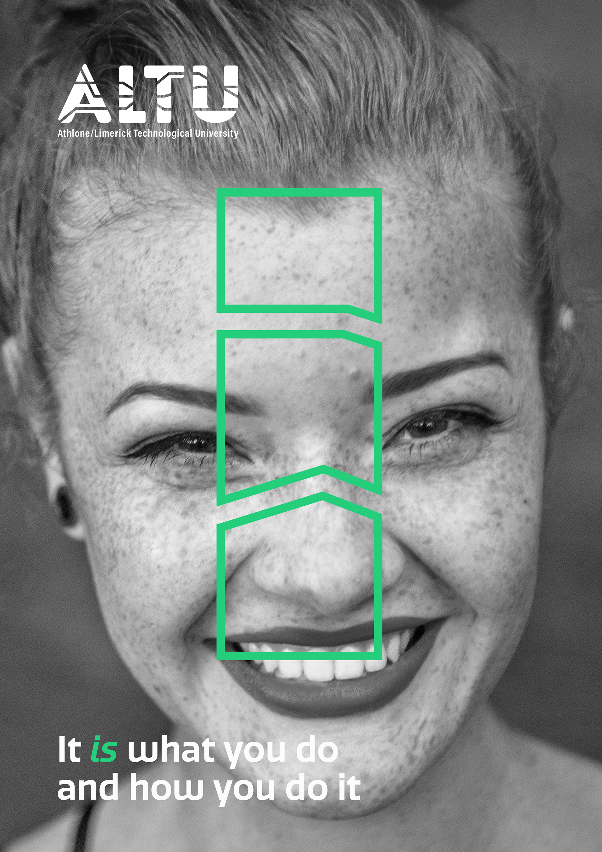
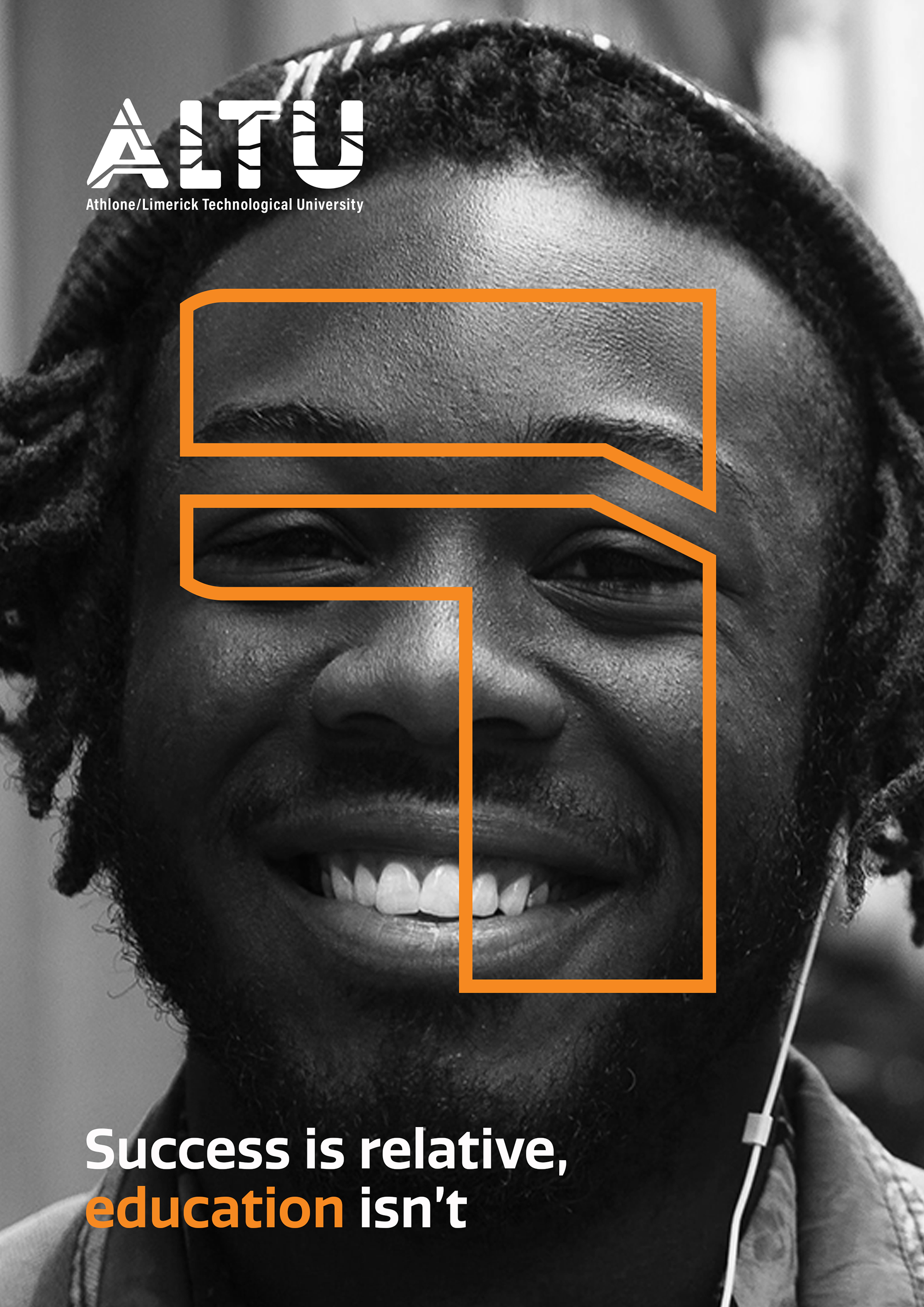
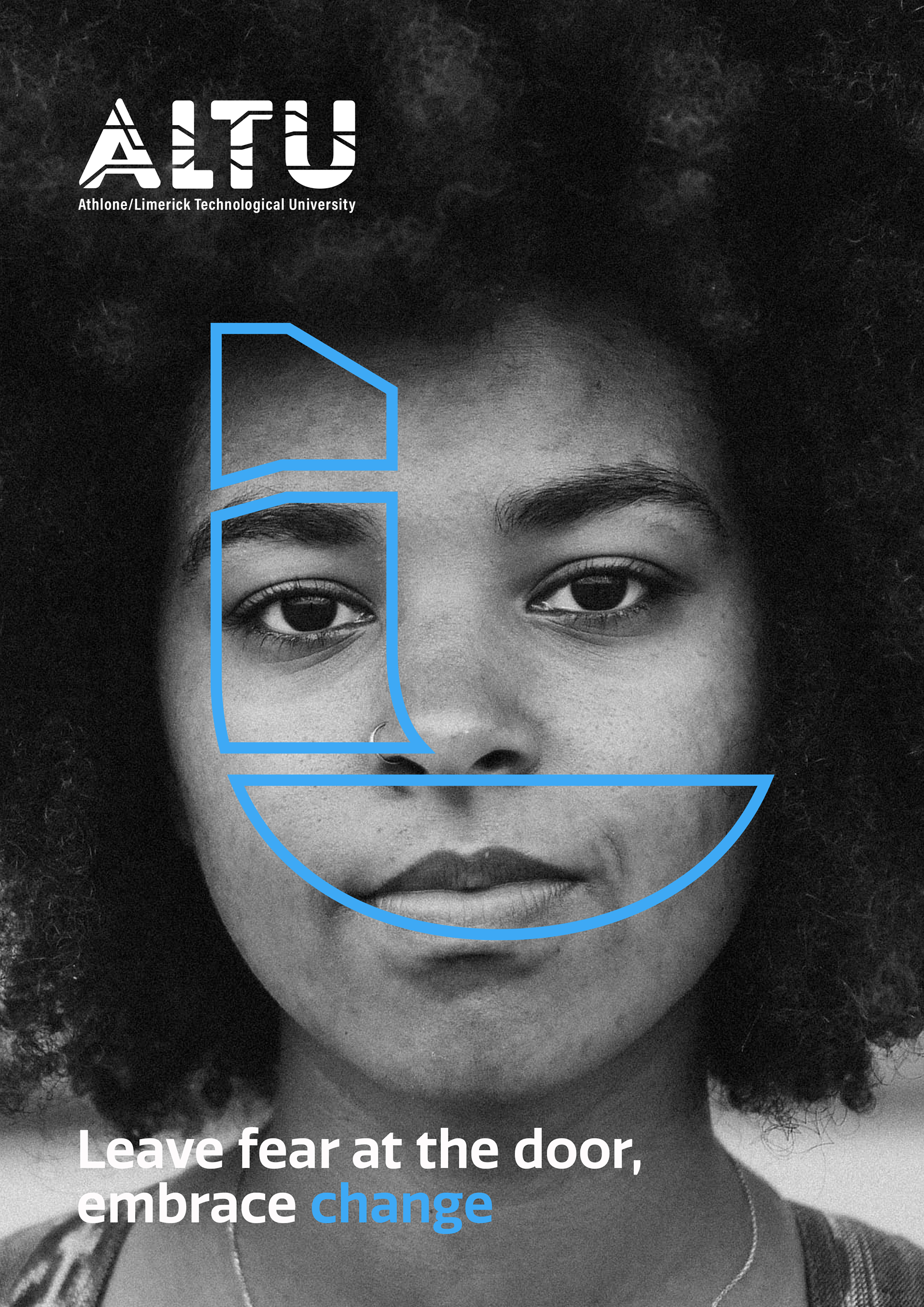
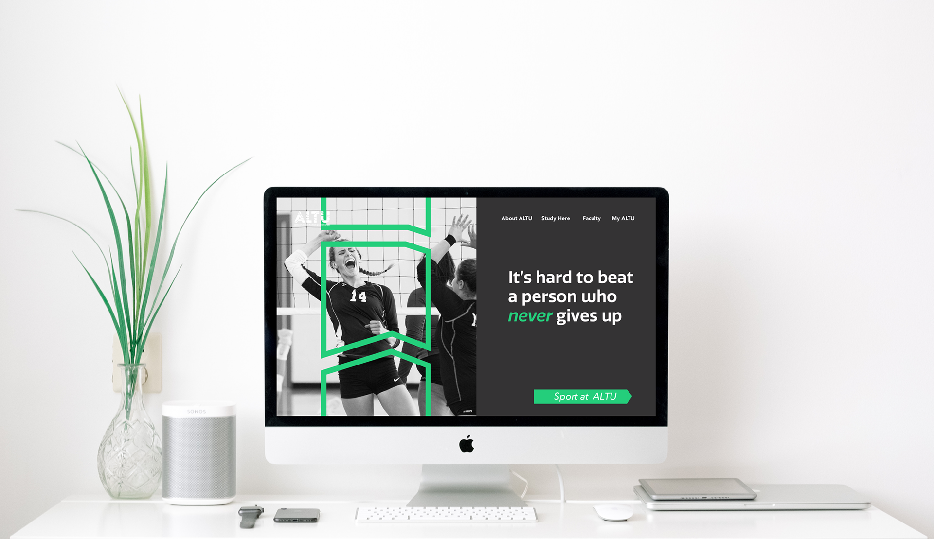
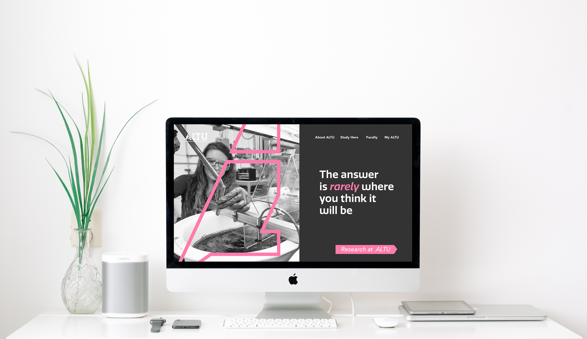
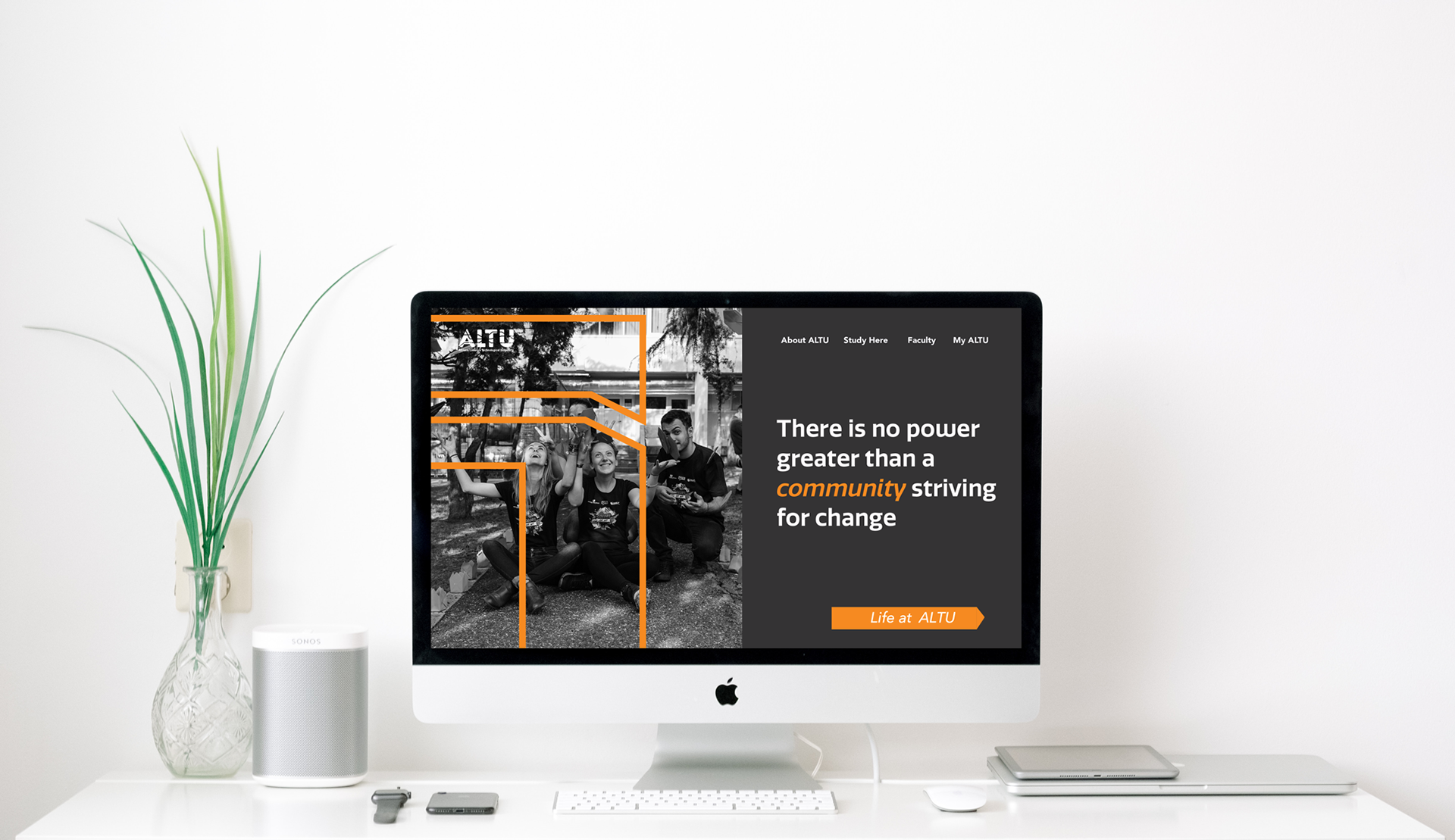
I developed a logotype that could be cut through and fragmented, creating multiple routes through the letterforms. Those fragments became more than a logo treatment — they formed the basis of a wider visual language that could adapt across faculties, campaigns and communications.
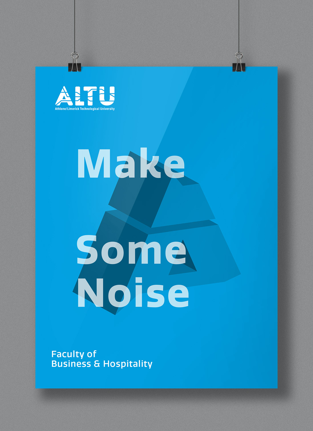
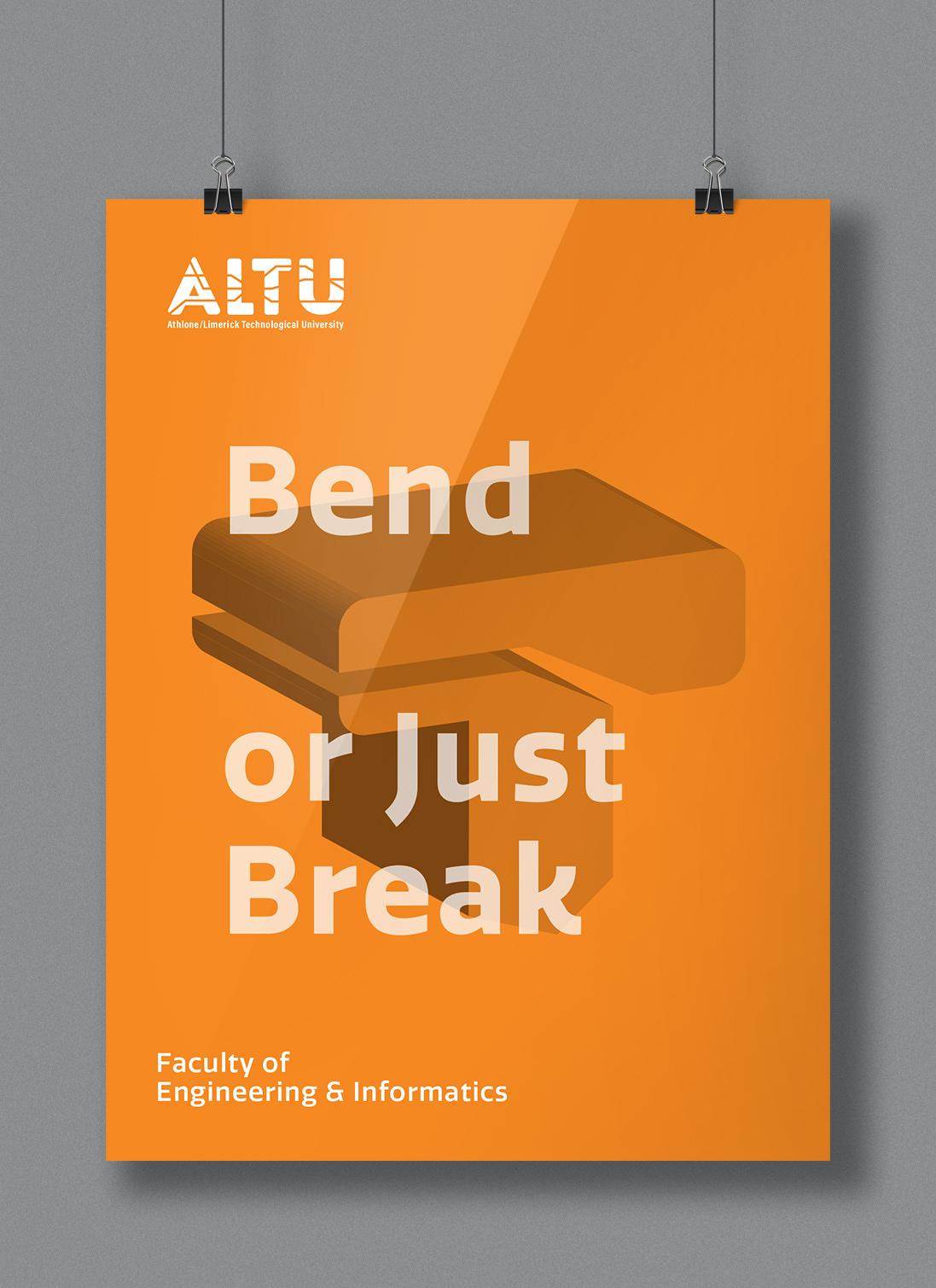
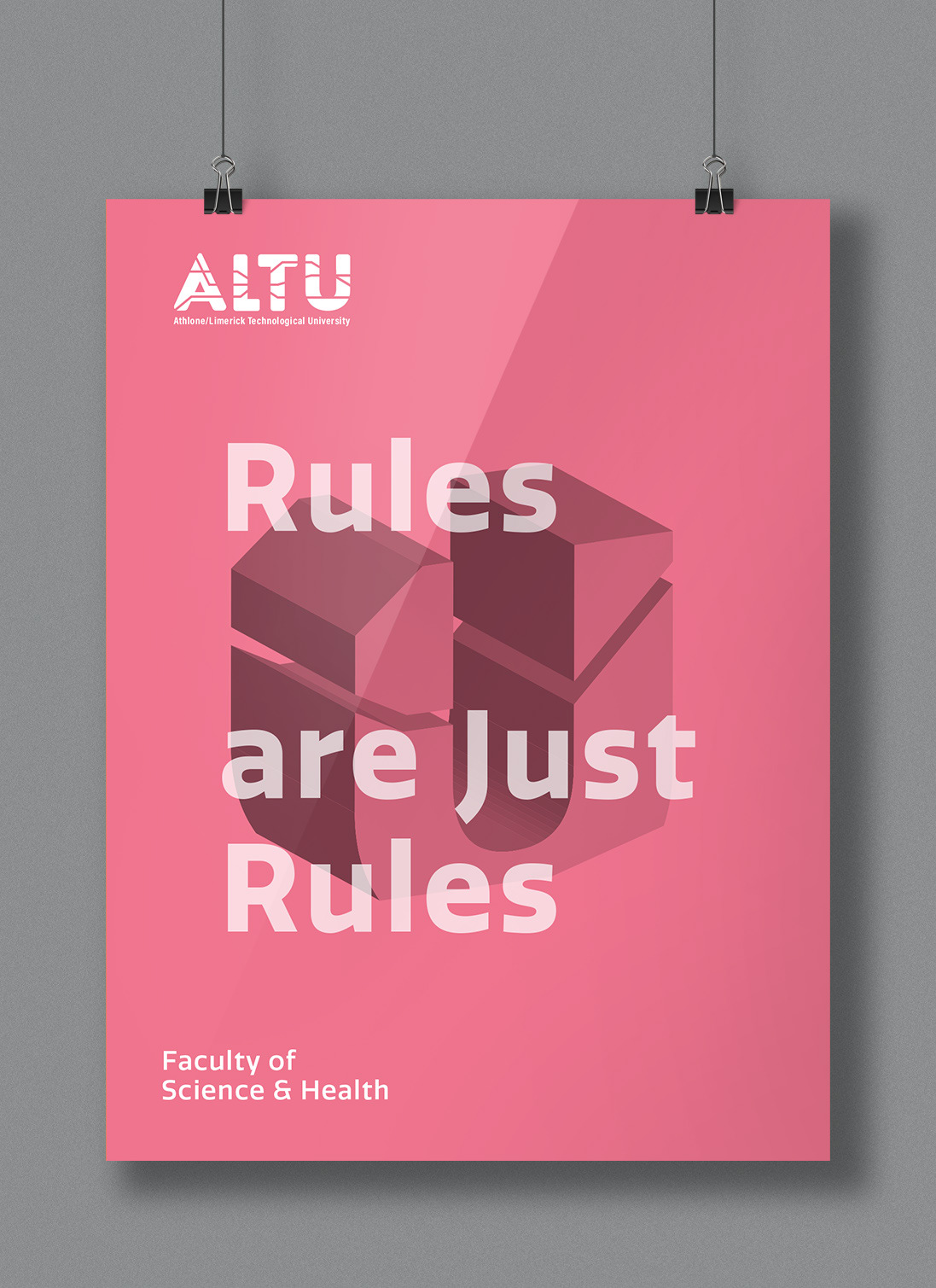
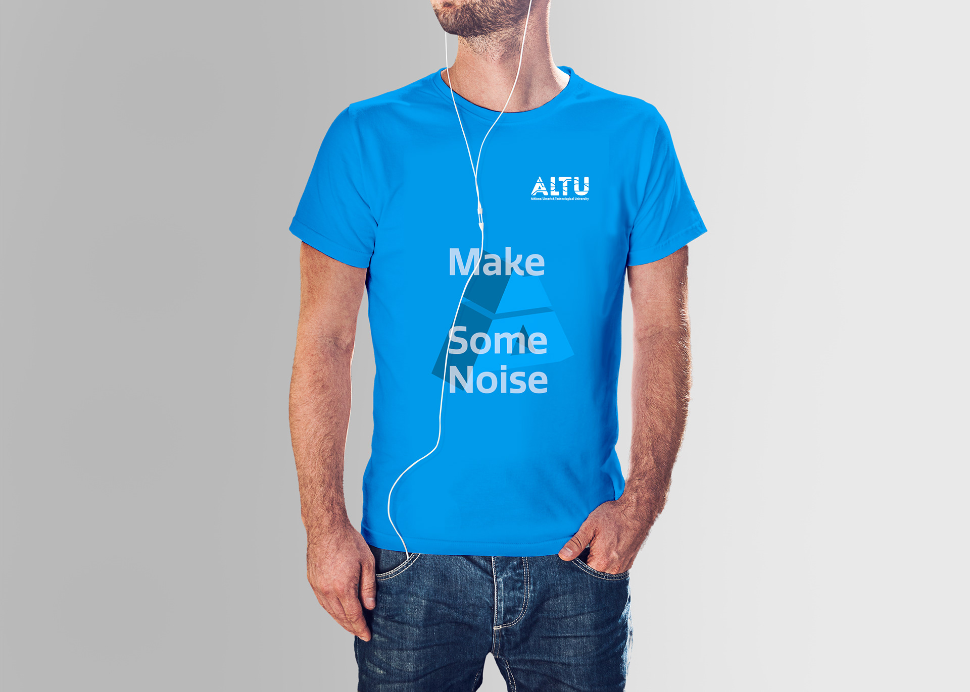
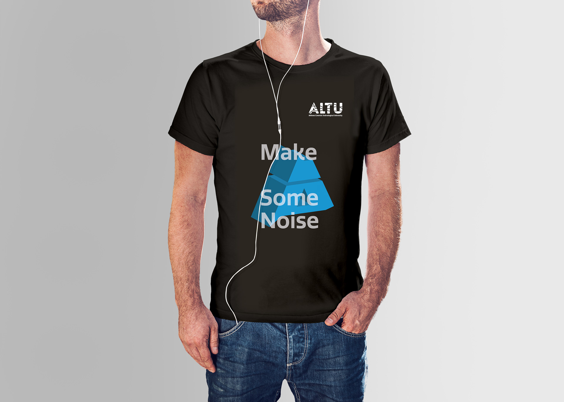
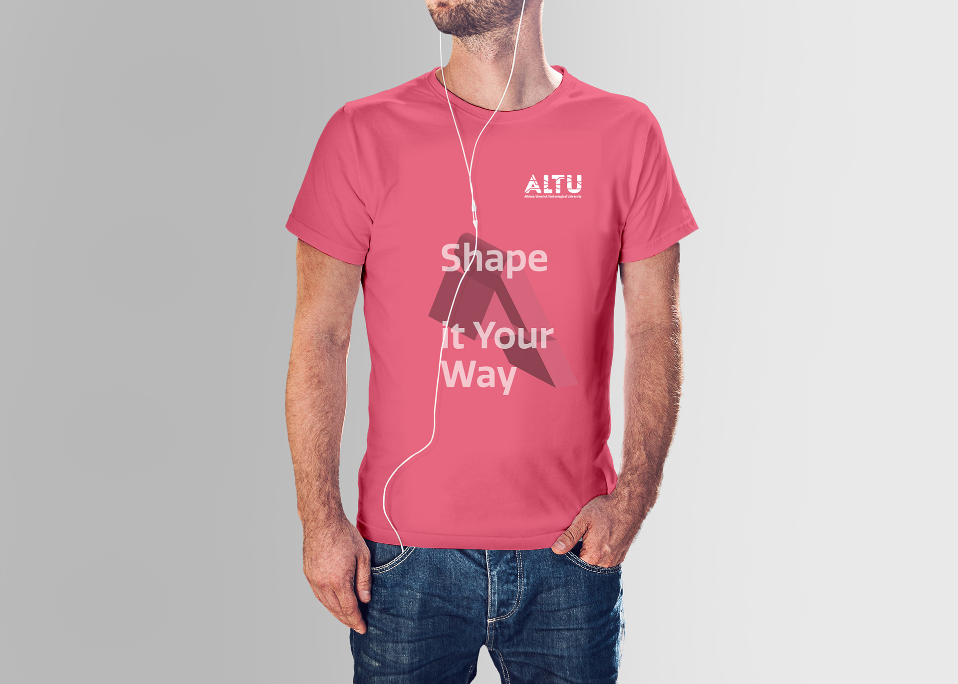
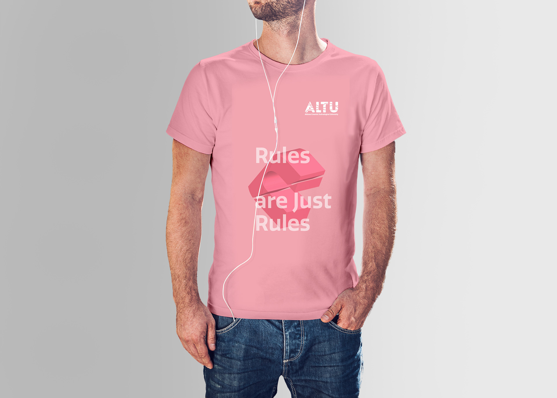
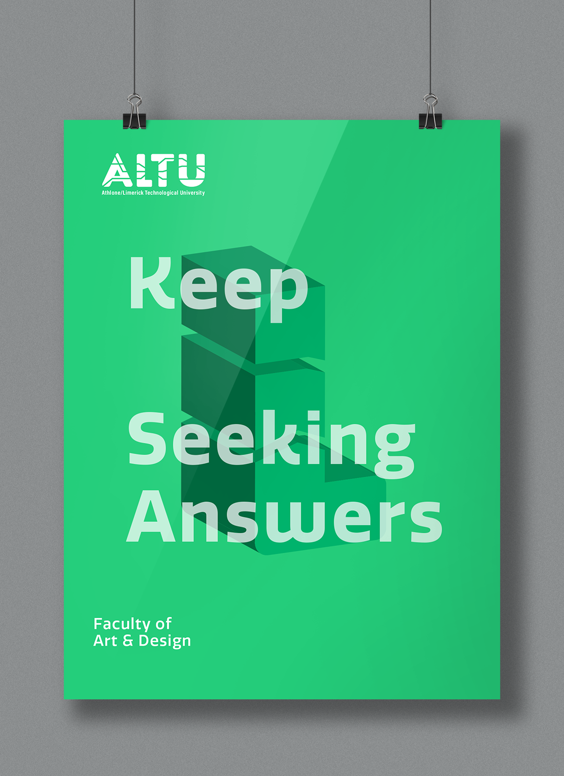
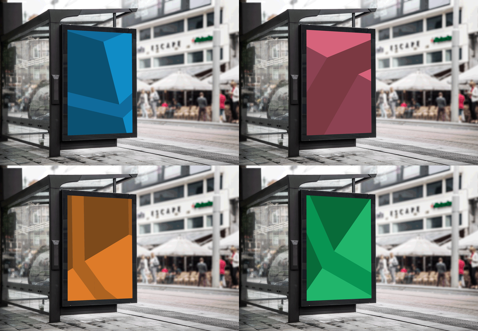
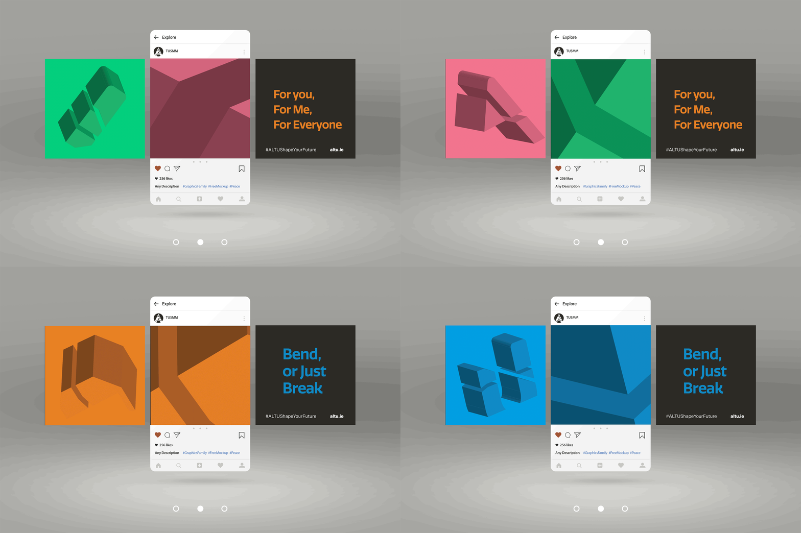
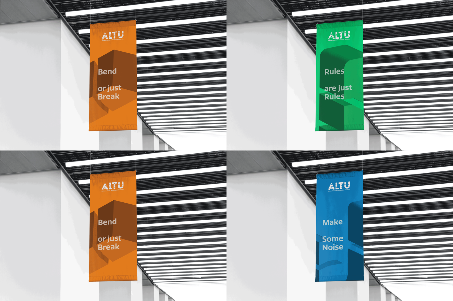
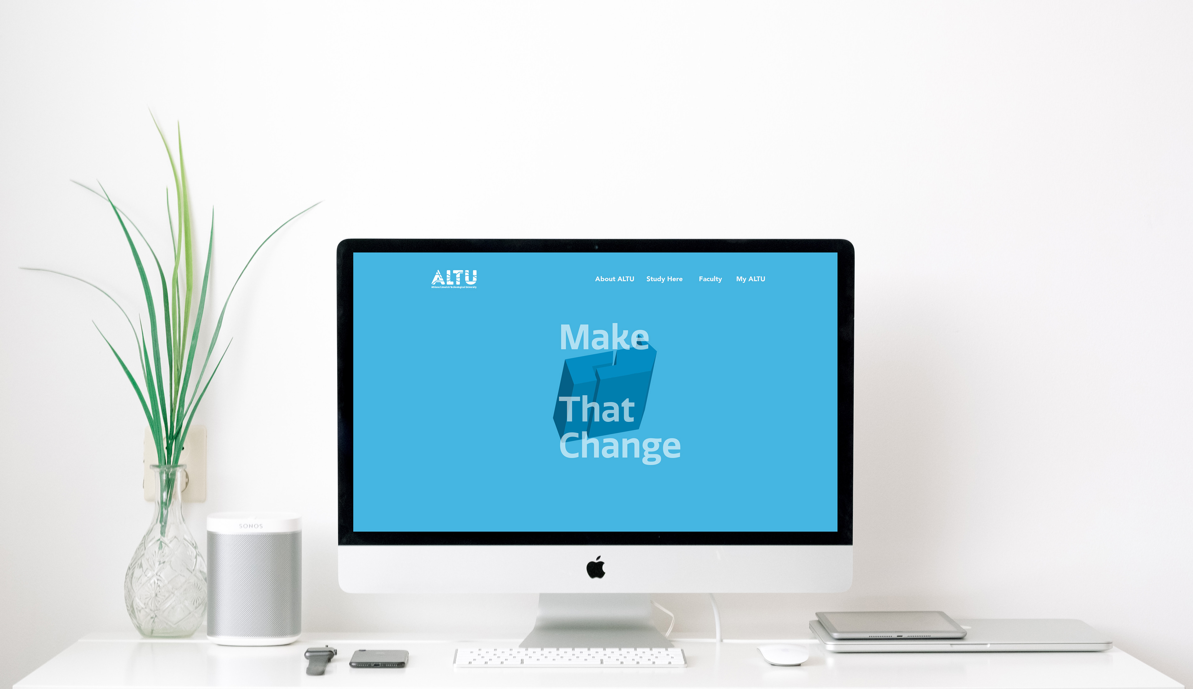
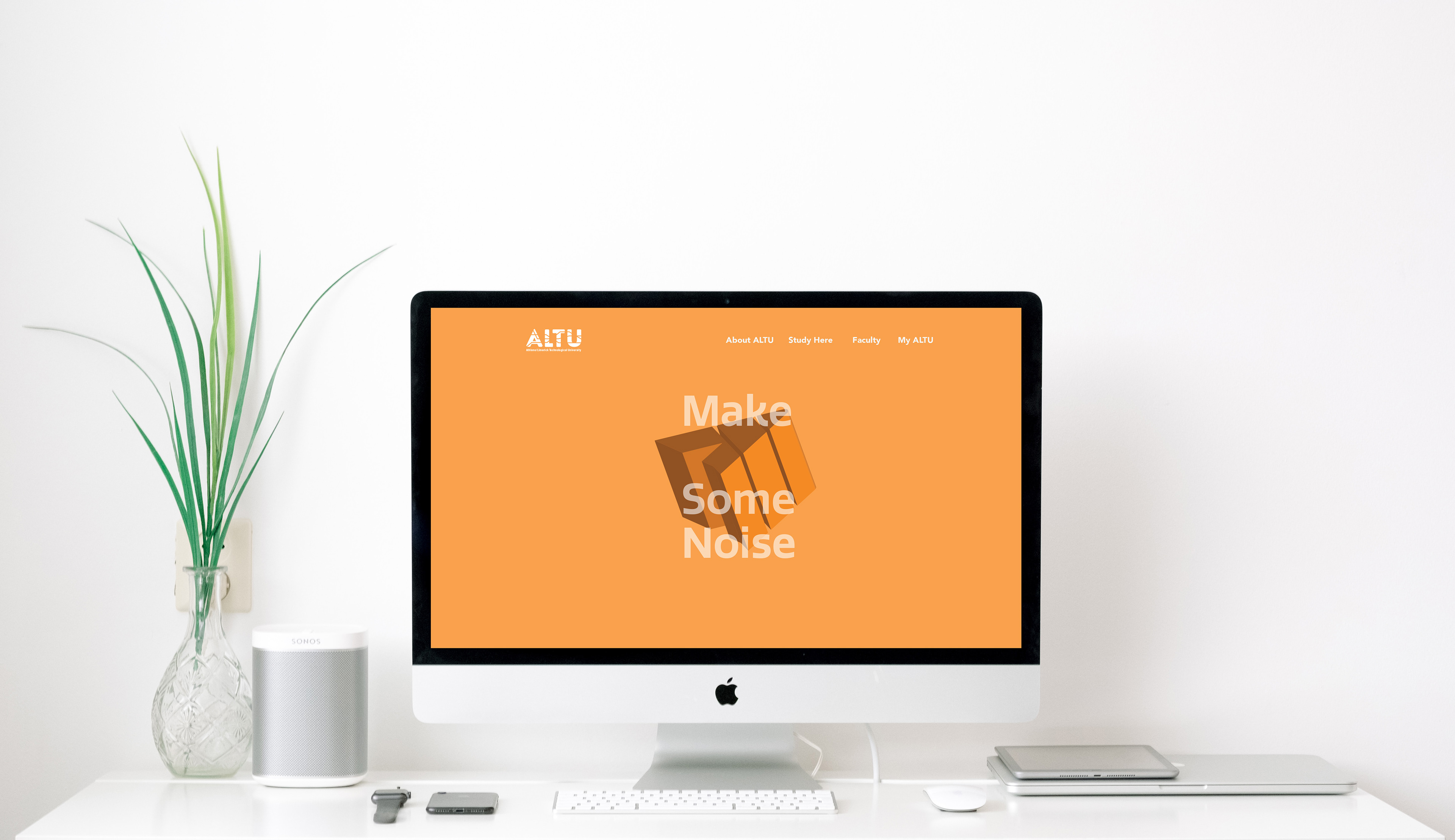
The system then evolved further by transforming the 2D fragments into 3D forms. The idea was to reflect how education can transform a person — taking something familiar and giving it new dimension, energy and possibility.
Colour, photography, typography and motion were all designed to work within that system. Different faculties were given their own bold colours, while the fragmented forms could move, scale, morph and change across print, digital, environmental graphics and merchandise.
The final identity was designed to feel bold, inclusive and adaptable — a brand system that could grow with the university rather than rely on one fixed visual device. The logo became the entry point to a much broader language of pathways, movement and transformation.